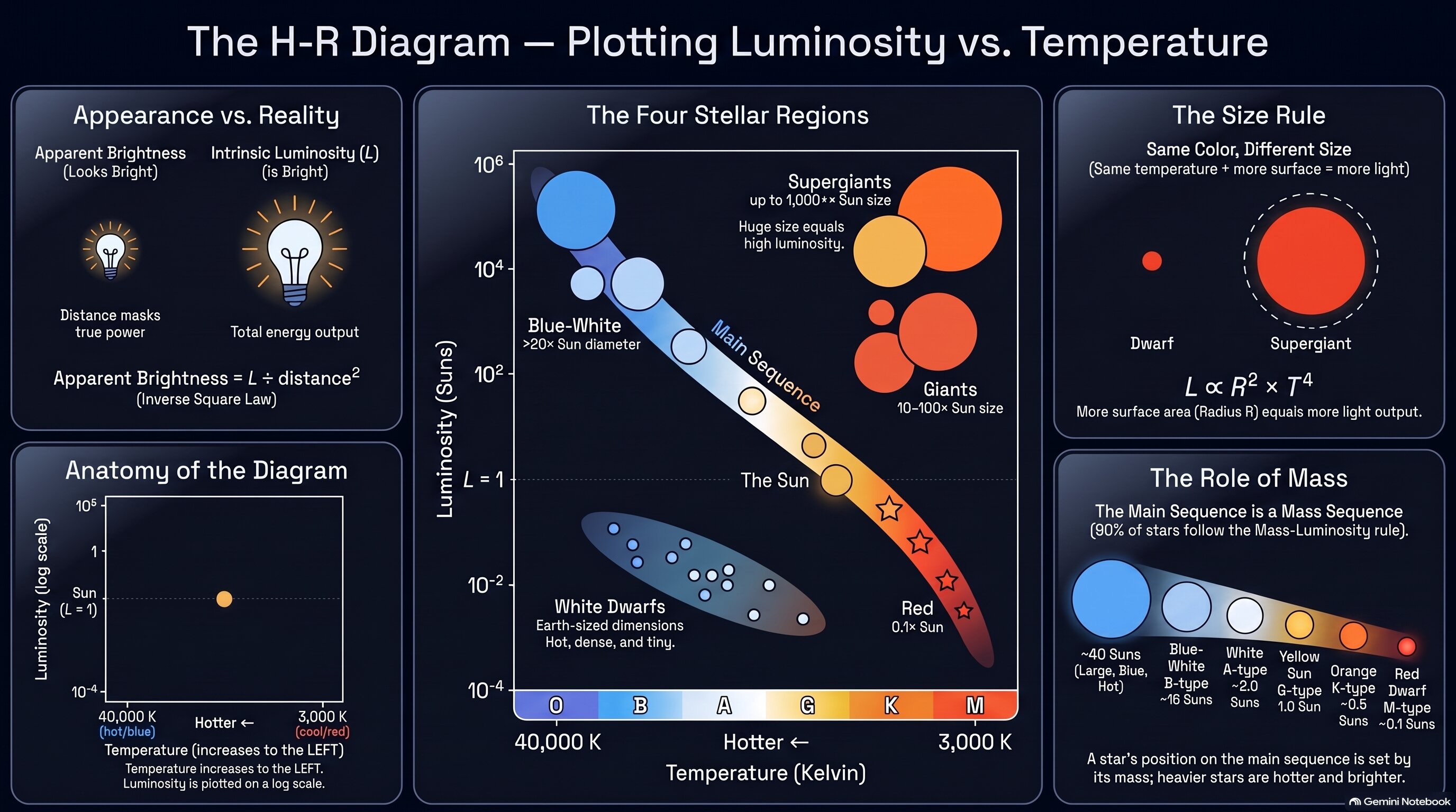
Quick reference for the H-R diagram's axes, its four major regions, and what a star's position tells you.
📈 Plot Summary
In the last activity, a spectrum gave you a star's temperature. But temperature alone can't tell you how much light a star really puts out — its luminosity. Around 1910, two astronomers, Ejnar Hertzsprung and Henry Norris Russell, independently had the same idea: plot every star's luminosity against its temperature and see what happens. The stars didn't scatter randomly. They fell into a few distinct groups — a long diagonal band called the main sequence, giants and supergiants above it, and a sprinkling of white dwarfs below. That graph, the H-R diagram, is the single most useful picture in stellar astronomy.
What you'll do in this activity
- Separate how bright a star looks from how bright it really is — and see why the brightest star in our night sky isn't even close to the most powerful.
- Build the H-R diagram one axis at a time, and learn to read a graph where temperature runs backward.
- Plot real stars and watch them fall into groups instead of scattering randomly.
- Use temperature and luminosity together to work out a star's size — from Earth-sized white dwarfs to supergiants wider than Mars's orbit.
- Discover what the main sequence really is: a line-up of stars sorted by mass.
Why it matters
Project 4.1.3, Stellar ID Cards, asks you to place every star you classify on an H-R diagram — and Problem 4.3.1, What Happens to This One?, hands you an unnamed star's position on this exact diagram. Where a star sits is the first clue to where it's headed.
✅ Self-Check Before You Roll On
Check off each item as you get there. These aren't grades — they're your own signal.